Module 5 "Touching Texture"

Module 5: "Touching Texture"

A study based on textured surfaces in landscape.

Saturday, 20 August 2011

Sketchbook day 26 Carbon Copies

I chalked all over the page and then covered up the chalk with multi-coloured wax crayons.  I did this on a separate sheet of paper, ordinary printer paper, because the thinner paper prints better than the thick cartridge paper of the sketchbook.  I then laid it, wax side down on top of my sketchbook page and drew the chair.  The chalk helped the wax to release from the paper.

I found this technique great fun.  I can remember using it with children when I was a teacher.  The fact that you can't rub out makes it necessary to draw boldly and that is good for me, since my drawings can tend to be a bit "tight".

In this first drawing I was just getting my eye in and getting to know the chair.  Some of the lines are a bit wonky but I quite like the effect.  I love the shadowy ghost chair on the paper on the left.

I tried it again, to see if I could improve my drawing.


I think I have got the perspective a bit better in this one, but I started drawing too big and so there wasn't enough space to fit the complete chair in.  I quite like it though.

Sketchbook day 25 perspective

I found the combination of mathematics and art very pleasing in this exercise and would have been happy to go on for hours with ruler and protractor (if I'd had time).  I used large paper (A2) so that I could extend the lines to their meeting place.


It was an interesting and useful exercise.

Friday, 19 August 2011

Summer Sketchbook Days 18-22

We've had the most horrendously wet summer here, but I did manage to get out when the rain had died down to a drizzle.  I took lots of photos before settling on the white daisies, which have been delighting me over the past few weeks.  Because of our summer weather I decided to work from the photograph.


First of all I tried out the scratching technique with various media as seen below:

Neocolor II Aquarelle washed with water on left hand side, chalk pastel on right hand side.


Neocolor II Aquarelle again on the left hand side.  The top half washed with water.  Oil pastels on the right.


I tried using wet media, watercolour and Koh-i-Noor paints, to capture the main areas of colour in parts of the garden. 


In each case, the print from the wet paint looks better than the original!
When I tried the wax resist, I started by drawing with crayons and oil pastels, painting a water based paint on top, but found the paint coloured the crayon or oil pastels and I couldn't get the white of the flowers.  However, when I tried drawing with a candle it worked beautifully.  Again, I think the print from the original looks better, although the scratch marks of the stems don't show in the print.


I tried the same exercise as Sian did with the sgrafitto, setting them out in an ordered fashion.  

One or two didn't work well, not because of the media, but because of my colour choices, and so I tried them again on the left hand page using different colours.  I used the information I gained to plan my sgrafitto picture.


layer 1


layer 2


finished picture


While working on this technique I remembered a similar technique I learned some years ago and tried it with my white flowers.  I painted the whole page with undiluted dark acrylic paint (I used Hooker's Green) and then worked on top with oil pastels.  The picture can then be scratched into, giving texture and revealing the darker acrylic paint behind the oil pastels.  The results are below:


Above is a picture I did some years ago of part of my garden using the oil pastels over dark acrylic paint and scratching back for texture.


Saturday, 13 August 2011

Days 12 - 16 Colour


I decided on a lime green as my colour scheme and collected together some objects in that colour.

A busy green worktable all ready to start.


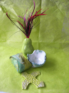
My final selection of objects making a still life

First of all I drew all the objects in outline and coloured in the background.  The paper I had used as a background had bits in it, so I first drew the bits with a yellow wax crayon, then painted over with Koh-I-Noor water based dyes.  I then added the shadows cast by the objects.

The next step was to take one of the objects and depict it in watercolour paints.


Next, I photocopied the coloured background and coloured all the objects using watercolour paint.


Pencil was the next medium to try.  This time I looked at the ceramic pear which had feathers attached to the top.

I went ahead and coloured one of the copies with pencil.  I used watercolour pencils so I could use a little water on a brush to blend the colours in some areas.

The third medium was pen.  I didn't think I would like this, but I was pleasantly surprised at the results.  I used a mixture of felt pens, ballpoint pens and gel pens, just whatever I could find.  I think I'll try drawing with these some more in the future.

Lastly, I used collage.  I really enjoyed this.  I used torn pieces of white paper to depict the highlights on the ceramic pear.  They turned out too bright so I cut a piece of sheer fabric (a cheap polyester in an olive green - very transparent) just to knock back the brightness without changing the tone of the rest.  The shadow on the right was newspaper which had been accidentally coloured by being behind fabric I'd painted with procion dyes. 

Duty calls.  I've got to put my "carer and housekeeper" hat on now.  I'm looking forward to trying the collage treatment on the whole still life tomorrow.

Sunday 14th August

Here is the still life done in collage.


I'm really quite pleased with how this has turned out.  I find I love doing collage.  One of my mental notes to myself is to carry on drawing every day.  Another is to try a lot more collage since I feel I've found a medium that really resonates with me.


Day 9: Puzzling Pattern

I found this really hard.  My first attempt I got lost in the stripes.  I was a bit happier with my second attempt, but I found this a day to quickly rush past!
First attempt

Second attempt

Saturday, 6 August 2011

Sketchbook project day 7: getting bigger

I used a brown soft chalk pastel for this. 

Sketchbook project day 6

I am enjoying this project more and more.  Each day's drawing is not too demanding and so it is easy to find the odd half hour to draw.  Drawing something every day increases my enjoyment and confidence and it becomes easier once you have got your eye and hand in.  When I am drawing, nothing else in the world exists - a very relaxing situation!


8B pencil.  It was lovely and soft for shading and smudging

A narrow nibbed 02 drawing pen.  It is nice to use the direction of the strokes to highlight the shape of the object.