Fibonnacci Sequence
I enjoyed doing these exercises - ideal for a busy time caring for poorly elderly relatives and entertaining a friend from California for a few weeks. I found that they could individually be fitted into a few minutes at the beginning or the end of the day, when I could snatch some time to myself. The combination of exact mathematics with design was an intriguing one and reminded me how much I used to enjoy geometry at school. (Yes, it made me a bit of a freak and unfortunately the liking didn't last once maths got too difficult!)
A word of explanation as to my numbering: The first number (in this case 2) refers to the module, the second number (9) refers to the chapter, F is for the Fibonnacci exercises and G is for the Golden Section exercises. The third number is the number of the exercises. This number corresponds to the number of the illustration in the instruction manual.
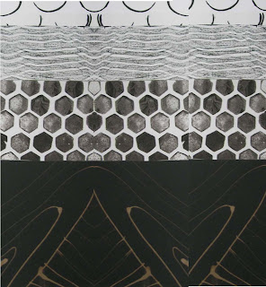 |
2.9.F1
|
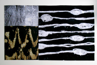
I love how 2.9.F3 looks. It somehow reminds me of a landscape with grassy areas and water seen through trees.
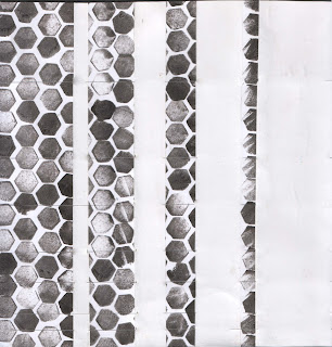 |
| 2.9.F4 |
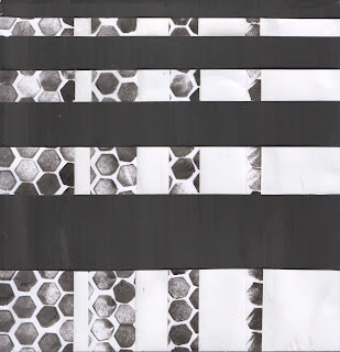 |
| 2.9.F5 |
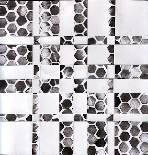 |
| 2.9.F6 |
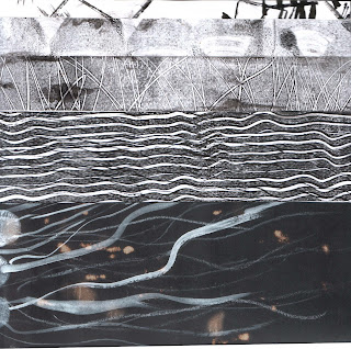 |
| 2.9.F7(1) strips cut according to Fibonnacci sequence |
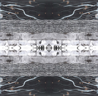 |
| 2.9.F7( 2 )exercise copied 4 times and pasted to make a symmetrical pattern |
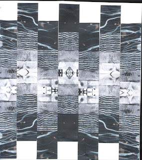 |
| 2.9.F8 - F7(2) cut into equal strips and alternate strips slipped down |
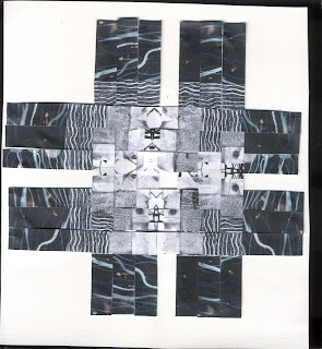 |
| 2.9.F9 - F7(2) strips arranged in log cabin pattern |
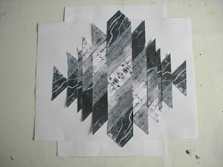 |
| 2.9.F10 |
Exercise F10 was formed by cutting F7(2) into diagonal strips and rearranging them. I like how this seems to have an oriental look. It makes me think of pagodas.
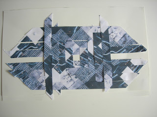 |
| 2.9.F11 |
In F11 the diagonal strips of F7(2) are arranged in a log cabin design. This design made me think somewhat of a fish and I couldn't resist using Photoshop to make it more so.
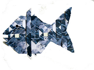 |
| 2.9.F11 variation just for fun! |
Sorry about the variation in tone in the illustrations: some were photographed (too big for my scanner) and some were scanned.
The Golden Section
I started, as suggested in the manual, by drawing the squares out on squared paper.
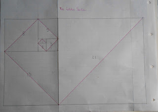 |
| 2.9.G1 |
 |
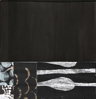
| 2.9.G2 the squares cut out of patterned paper and arranged in a similar way to G1 |
 |
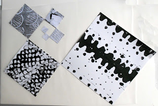
| 2.9.G3 the rectangles treated in a similar way |
I found it very interesting that when the squares were arranged as above, they formed a rectangle and when the rectanges were so arranged, they formed a square.
 |
| 2.9.G4 |
In G4, I traced the spiral formed by the diagonal lines onto tracing paper, then constructed the square on each diagonal and cut it out of the patterned paper, before sticking it down along the diagonal line, so that the whole arrangement forms a spiral.


Wow Catherine! You have an amazingly contrasting selection of light and dark prints there! I particularly like the hexagons. Very 'snakey', and contrasts well with the black bleached panels in 2.9, F1,2&3.
ReplyDeleteLOVE THE FISH! :)
The hexagons were the easiest thing - just prints with the end of an ordinary pencil!
DeleteMore lovely stuff - Like you I really enjoyed this chapter.
ReplyDeleteThese look fascinating Catherine. What lovely papers. I'll look forward to getting to that stage myself.
ReplyDeleteI really enjoyed looking at these Catherine and the previous chapter, beautiful work. Well done!Fabulous designs.
ReplyDeleteCatherine, the fish in the picture 2.9.F11 should be preserved and framed . The pattern is great and the idea to make of it a fish is super.
ReplyDeleteThanks Maren, you've just given me an idea for my final outcome. A basket of fish would be a nice idea and would be a good way of linking with my husband's family business of herring curing.
DeleteThe colors shine beautifully. I can empathize your desire finally to work with colors and not only with black and white.
ReplyDelete