Module 5 "Touching Texture"

Module 5: "Touching Texture"

A study based on textured surfaces in landscape.

Friday, 17 July 2009

Module 1 Chapter 7 July 2009

I really struggled with this chapter: I didn't enjoy doing the work and, mostly, I didn't like the end result. I found it hard to understand the instructions at first. It seemed so boring and labour-intensive compared with the excitement and instant gratification of the Bondaweb chapter. I thought that my results looked clumsy and rather flat and dull. I thought that the bought fabrics were flattening the look of it, so tried to break up the surface with transfer paints. I don't have any fabric paints or dyes at the moment other than those. It worked quite well, I thought, and left interesting papers which I might use some time in the future. Gradually, I am now beginning to see possibilities in this technique, so will linger on this chapter, trying more ideas, until I find something I am really pleased with.

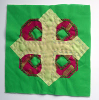
Applique 1

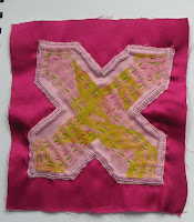
Applique 2

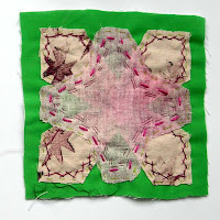
Applique 3


After a break of a few weeks, with various visitors staying and a week walking the Speyside Way, I went back to the chapter and tried a few more ideas, including the transfer paints.
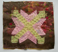
Applique 4
I used one of the Bondawebbed backgrounds for this, and also experimented a bit with the stitches used. I think, though, that the pink and green are too close in tone. I still find it hard to anticipate how the colours will look at the end of the process when I am laying them out at the beginning.


Applique 5

I am much happier with this one. I used the transfer printed background and got back to my beloved bird shapes. The pale pink one on top looked rather solid and obscured too much of the green one, despite using a loosely woven muslin. So, I tried adding a pulled thread stitch so that more of what was behind would show. Apologies about the masking tape. It was just to hold it down to photograph it since the stitching distorted it a bit. I'll mount it properly at the end of the chapter.
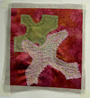


Applique 6

I tried cutting the other way with this one, ie cutting out inside the shapes instead of outside. I think it kind of looks interesting but too much is hidden. Maybe I need to cut out more shapes, or add some transparent shapes over the top.... This is a work in progress.

More to follow on this chapter. It is so long since I posted anything that I thought I'd better put something on, then I can post again once I've done more work.

No comments:

Post a Comment