Module 5 "Touching Texture"

Module 5: "Touching Texture"

A study based on textured surfaces in landscape.

Saturday, 6 August 2011

Sketchbook project day 6

I am enjoying this project more and more.  Each day's drawing is not too demanding and so it is easy to find the odd half hour to draw.  Drawing something every day increases my enjoyment and confidence and it becomes easier once you have got your eye and hand in.  When I am drawing, nothing else in the world exists - a very relaxing situation!


8B pencil.  It was lovely and soft for shading and smudging

A narrow nibbed 02 drawing pen.  It is nice to use the direction of the strokes to highlight the shape of the object.

Thursday, 4 August 2011

Sketchbook day 5

With tea a subject close to my heart and having started the sketchbook by making a cup of tea, I thought I would like to draw my old favourite, well used and well loved little teapot.  I prepared the background for the first two drawings by emptying out used teabags, drying the paper, tearing it up and gluing it down onto the sketchbook page.  For the second two drawings, I became interested in the reflections on the shiny surface, so tried to depict them in my drawing.  For the background to these, I printed some information on the history of tea from the British Tea Council's webside, glued them to the sketchbook pages and tinted them with tea.

"Learning your lines" 1
Conte clutch pencil with chalk lead

"Learning your lines" 2
Conte pencil as above


"Learning your lines" 3
Conte pencil as above


"Learning your lines" 4
Ordinary 2B pencil

Sketchbook day 4

I tried some ideas to play around with the quality of line, drawing a cut pepper.   I didn't really like how the drawings turned out, however the process of taking a half hour or so to myself (away from being a nurse/housekeeper!) were very satisfactory and I enjoyed doing the drawing even though I'm not very pleased with the results.


Sketchbook day 4 (1)
Drawing done with non-waterproof pen, inside painted over with water to blur outline. 
Diluted ink added afterwards to suggest form.


Sketchbook day 4 (2)
I tried drawing onto a wet surface with a non-waterproof pen.
I worked into it afterwards (also on wet paper) with a new pencil I bought recently:
a Derwent Inktense, which dissolves in water.  Nice effects, but will need to practise with it some more.

Sunday, 31 July 2011

Summer Sketchbook Project

Events have kind of caught up with me the last couple of weeks.  My husband was rushed to hospital for emergency surgery.  He is making a good recovery and has been transferred from the big city hospital 30 odd miles away to the local cottage hospital in our village.   Visiting is much easier, so I now have some time to myself and the summer sketchbook project seemed like a bit of light relief and an affirmation that there is life outside hospital visits.

Day 1
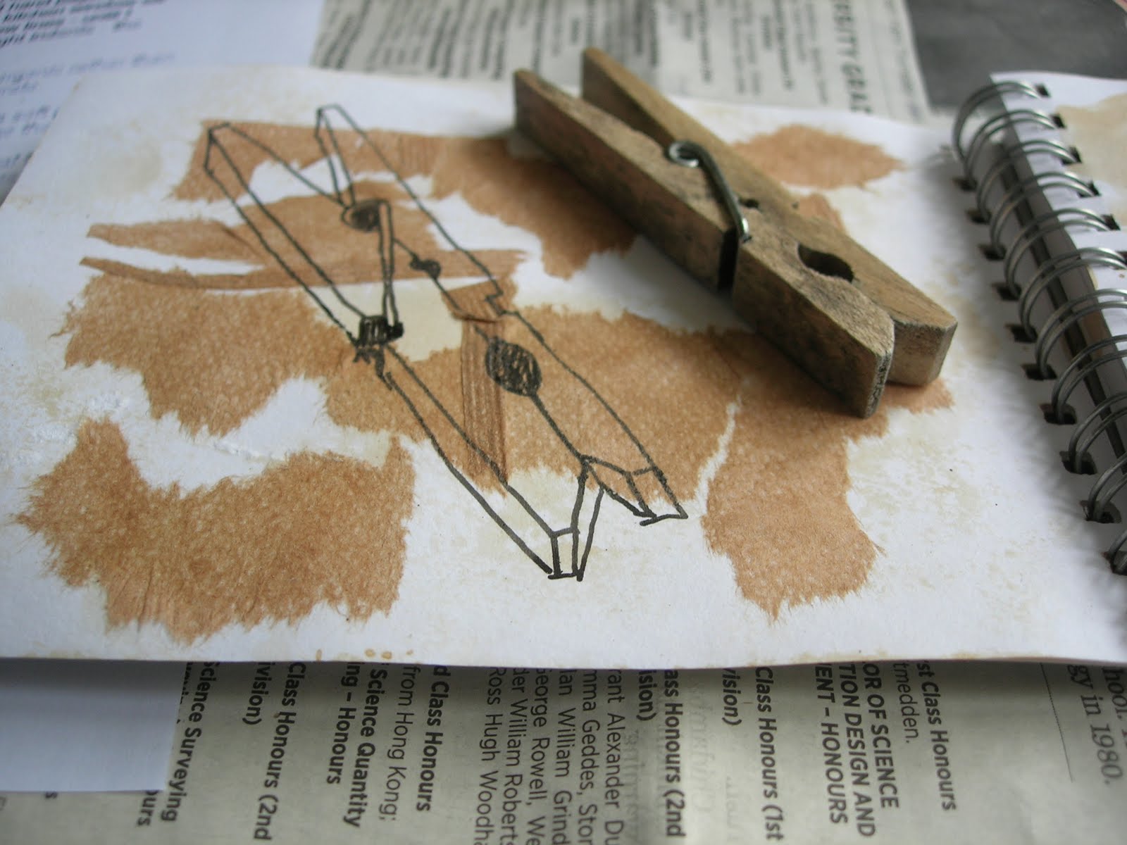
I enjoyed colouring the pages of the sketchbook (and drinking the tea!) and had the idea to empty the used teabags, dry the paper and tear it up to glue down on the pages of the sketchbook.
 I also sprinkled over the wet contents of the teabags and shook them off when dry.  They gave a nice concentrated speckling. 
I tore up some bus tickets to and from the hospital and glued them down too.
  This bit was fun and not too much to think about.

Days 2 and 3
I have washed so many pairs of pyjamas over the last two weeks that a clothes peg seemed an appropriate thing to draw.

08 drawing pen


08 drawing pen


08 drawing pen


08 drawing pen

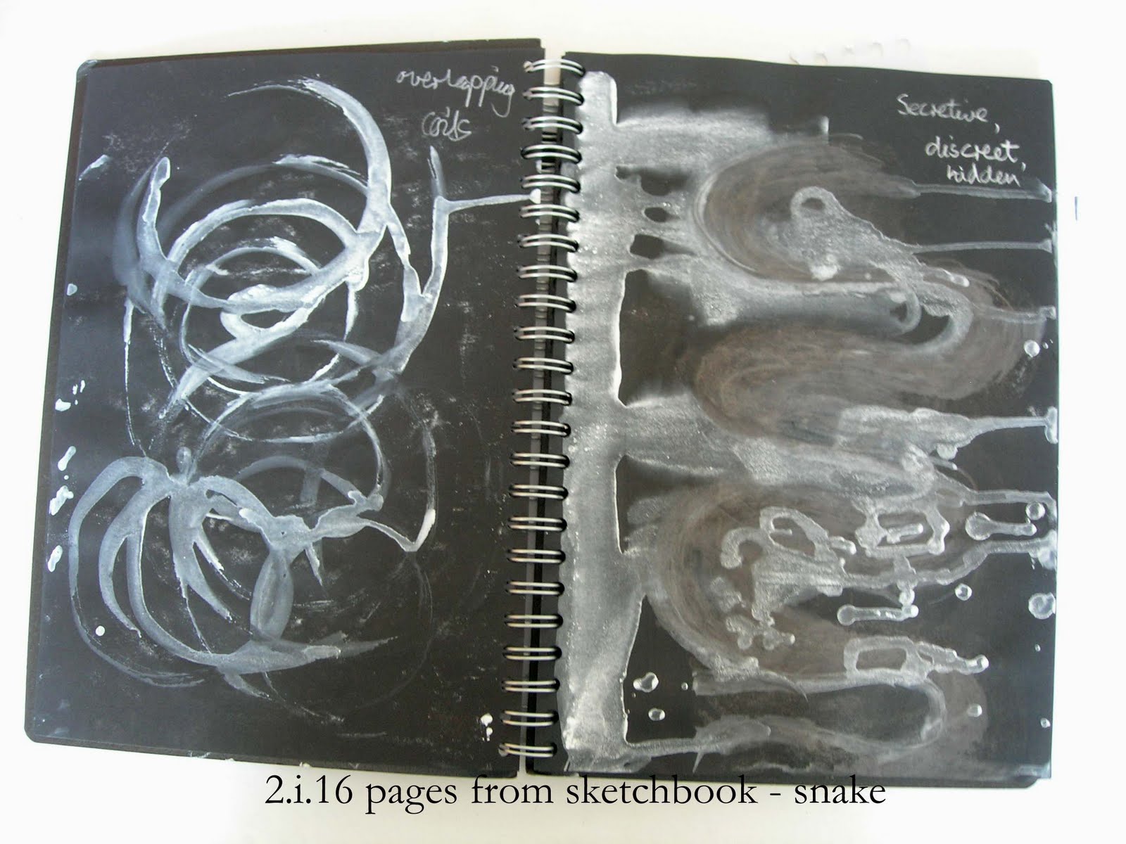
I found a shrivelled leaf in the garden and thought it would be interesting to draw.  I've been drinking so much tea lately and tea is made from a dried leaf, so it seemed to fit the tea theme.  I have always found tea a great comfort and so I am drawing my source of comfort and relief from stress!

Conte graphite 2B pencil

Conte graphite 2B pencil


I liked the colour of the brown pen.  It looked well with the tea-coloured paper


The chalk pencil gave a softer line.  I feel I haven't made the best use of this but will try in future drawings.

Friday, 29 April 2011

Module 2 Chapter 2: Tonal Columns in Stitchery

Tonal Column in Canvaswork


2.2.1
To start with I found it difficult to do the shading for this.  I tried to be clever and start in the middle with a mid-tone and thought I could get lighter to one end and darker to the other.  However, I eventually found it better to start at the lighter end and get gradually darker.  I found that if I got the basic shading right with thicker thread, I could fine tune it by adding stitches in a fine yarn.


Blackwork Tonal Columns

It is 20 years since I last did any blackwork and I fell in love with it all over again.  I spent lots of time happily doodling patterns on squared paper.  I found Jack Robinson's little booklet "Blackwork Embroidery: My Methods and Techniques" to be very useful.


2.2.2 paper design for blackwork


2.2.3Tonal blackwork column based on paper design
In 2.2.2, the paper design and 2.2.3, the stitched column, the shading is achieved by adding elements to the pattern to make it darker.


2.2.4

In sample 2.2.4, the shading is achieved by working the motifs closer together and even overlapping them.


2.2.5

In sample 2.2.5, the shading is achieved by using progressively thicker thread to work the design.

2.2.6

In sample 2.2.6, the shading is achieved by altering the scale of the pattern.  As the motif gets smaller, it looks darker.

Module 2 Chapter 1: Tonal Study

Tonal Columns

I really enjoyed doing these tonal columns.  I got so carried away that I forgot to put rubber gloves on before working with waterproof ink, so went around with black fingers and nails for a day or two afterwards!

2.1.1 Tonal Columns

Column 1 was black ink dabbed on with a crumpled tissue.
Column 2 was pieces of newspaper glued on.
Column 3 was lines drawn with a felt pen and brushed with water afterwards.
Column 4 was printed with the edge of a piece of card with black ink.
Column 5 was black ink dabbed on with a cotton bud.
Column 6 was dots drawn on with a felt pen.
Column 7 was very diluted ink dabbed on with a soft paintbrush, getting more concentrated as I went down.
Column 8 was charcoal.


I then tried some of the special effect brushes on Photoshop to make shaded columns on the computer.


Module 2 introduction: abstracting a design from animal markings

Collecting visual information

I started by photographing some drawings of a snake skin which I had done some years ago.  I cut and pasted the images to make a composite picture.


I then used Photoshop to convert the image to greyscale and then applied a photocopy filter.


I did exactly the same thing with some old drawings I had done of fish.


I played around with cutting and pasting to get a less rigid fish composite:


Words describing subject

Looking at my two main subjects of snake and fish I considered words which I associated with them.


Drawing

I used the words to inspire me to make marks which I felt communicated something of the feel of the subject.