
Sunday 20 September 2009
Grrr!!!

I tried printing one of my original paper samples from the computer onto crumpled brown wrapping paper (which I had first glued to a carrier sheet as detailed in "From Image to Stitch" by Maggie Grey). I tore it into a rectangle and bonded it onto a sandwich of snippings trapped between lime green lining fabric and transfer printed chiffon. I am quite pleased with the effect of the printed brown paper. I intend to stitch into this, but have not yet decided whether to do it by hand or machine.
Lastly, just for interest, I've included a photo of the clay birds I made at an evening class, inspired by my embroidery work. Some of the ideas from the clay are feeding back into my embroidery - very satisfying.


While needlefelting the shapes onto sample 1/8/1, I accidentally discovered that if I simply punched the needlefelting tool into a piece of organza, it would produce a crinkle effect. I cut out a bird shape and tried washing and drying it to see if the effect would stay. It did. I'm still thinking of a way to use it.

I started with a printed letter, which I painted with red/violet dye and tore up into shreds. I glued the shreds to a piece of bright green dyed paper using PVA, painting some of the PVA over the surface to give a shiny effect. This I tore into a rough rectangle. I then cut two bird shapes out of transfer printed sheer fabrics and bonded them on top of the paper rectangle. I applied the rectangle onto a piece of wine coloured polyester chiffon using an overcast stitch with one strand of wine coloured stranded cotton and outlined the bird shapes with running stitch using metallic thread. The top bird shape is in a sheer fabric which is shot with gold and I like how, in certain lights, it gleams against the dark, rich background. I also like how little snatches of print are still visible in one small area. (It was a confidential letter I had to destroy - much more fun than just shredding it!) I like how the paper looks like leather.


Pale pink polyester satin was printed with wine-red bird shapes using transfer paints. It was sandwiched with wadding and pale green dupion backing. I then stitched around the bird shapes using close free machining. I used lime green rayon thread in the top and wine coloured thread in the bottom. Sample 1/8/3 shows the reverse of the piece. I had originally intended this to be the first step of a multi-layer piece, but I rather like the simplicity of this sample, so shall leave it as it is. I think I might do some more work on the reverse of the piece, perhaps bonding some bird shapes in transfer printed sheers.
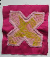
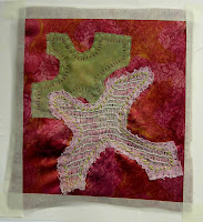
Module 1 Chapter 8 Sample 1


This was a development of a sample I began in Chapter 7 but wasn't too pleased with. I added two more bird shapes, one in wine coloured polyester satin which had been printed in green. I needlefelted it onto the base. The other bird shape, also needlefelted on, was in dyed and printed pale pink muslin. This second shape I then machine stitched over in green, trying to show the direction of the feathers, and outlined in machine stitching also in green. I had found the buttonhole stitch rather too prominent and was delighted to discover that if I needlefelted over the stitches, they disappeared into the fabric and were much more subtle. I think the overall design is a bit too busy and I'm not entirely satisfied with the composition, but it did improve what I had originally thought a bit of a disaster.
Module 1 Chapter 8


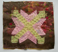
Sample 1/8/1
This was a development of a sample I began in Chapter 7 but wasn't too pleased with. I added two more bird shapes, one in wine coloured polyester satin which had been printed in green. I needlefelted it onto the base. The other bird shape, also needlefelted on, was in dyed and printed pale pink muslin. This second shape I then machine stitched over in green, trying to show the direction of the feathers, and outlined in machine stitching also in green. I had found the buttonhole stitch rather too prominent and was delighted to discover that if I needlefelted over the stitches, they disappeared into the fabric and were much more subtle. I think the overall design is a bit too busy and I'm not entirely satisfied with the composition, but it did improve what I had originally thought a bit of a disaster.
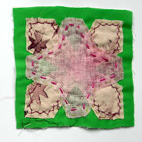
Samples 1/8/2 and 1/8/3
Pale pink polyester satin was printed with wine-red bird shapes using transfer paints. It was sandwiched with wadding and pale green dupion backing. I then stitched around the bird shapes using close free machining. I used lime green rayon thread in the top and wine coloured thread in the bottom. Sample 1/8/3 shows the reverse of the piece. I had originally intended this to be the first step of a multi-layer piece, but I rather like the simplicity of this sample, so shall leave it as it is. I think I might do some more work on the reverse of the piece, perhaps bonding some bird shapes in transfer printed sheers.
Sample 1/8/4
I started with a printed letter, which I painted with red/violet dye and tore up into shreds. I glued the shreds to a piece of bright green dyed paper using PVA, painting some of the PVA over the surface to give a shiny effect. This I tore into a rough rectangle. I then cut two bird shapes out of transfer printed sheer fabrics and bonded them on top of the paper rectangle. I applied the rectangle onto a piece of wine coloured polyester chiffon using an overcast stitch with one strand of wine coloured stranded cotton and outlined the bird shapes with running stitch using metallic thread. The top bird shape is in a sheer fabric which is shot with gold and I like how, in certain lights, it gleams against the dark, rich background. I also like how little snatches of print are still visible in one small area. (It was a confidential letter I had to destroy - much more fun than just shredding it!) I like how the paper looks like leather.
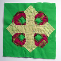
Sample 1/8/5
While needlefelting the shapes onto sample 1/8/1, I accidentally discovered that if I simply punched the needlefelting tool into a piece of organza, it would produce a crinkle effect. I cut out a bird shape and tried washing and drying it to see if the effect would stay. It did. I'm still thinking of a way to use it.
Sample 1/8/6 (work in progress)
I tried printing one of my original paper samples from the computer onto crumpled brown wrapping paper (which I had first glued to a carrier sheet as detailed in "From Image to Stitch" by Maggie Grey). I tore it into a rectangle and bonded it onto a sandwich of snippings trapped between lime green lining fabric and transfer printed chiffon. I am quite pleased with the effect of the printed brown paper. I intend to stitch into this, but have not yet decided whether to do it by hand or machine.
Lastly, just for interest, I've included a photo of the clay birds I made at an evening class, inspired by my embroidery work. Some of the ideas from the clay are feeding back into my embroidery - very satisfying.
Friday 17 July 2009
Chapter 7 - additional


Module 1 Chapter 7 July 2009
Applique 1
Applique 3
After a break of a few weeks, with various visitors staying and a week walking the Speyside Way, I went back to the chapter and tried a few more ideas, including the transfer paints.
Applique 5
I am much happier with this one. I used the transfer printed background and got back to my beloved bird shapes. The pale pink one on top looked rather solid and obscured too much of the green one, despite using a loosely woven muslin. So, I tried adding a pulled thread stitch so that more of what was behind would show. Apologies about the masking tape. It was just to hold it down to photograph it since the stitching distorted it a bit. I'll mount it properly at the end of the chapter.
Applique 6
I tried cutting the other way with this one, ie cutting out inside the shapes instead of outside. I think it kind of looks interesting but too much is hidden. Maybe I need to cut out more shapes, or add some transparent shapes over the top.... This is a work in progress.

More to follow on this chapter. It is so long since I posted anything that I thought I'd better put something on, then I can post again once I've done more work.
Wednesday 13 May 2009
Module 1 Chapter 6: extra
13th May 2009
I really enjoyed this exercise, so, having an unexpected day off today, I tried some more ideas. Here they are:
Sample 1

I sponged a square of Bondaweb with a crimson acrylic and mauve acrylic mixed with irridescent medium. Once dry, I printed two bird shapes on with lime green acrylic paint. I bonded it on to pale pink cotton, laid a green tracing paper bird shape on top, then bonded dark pink chiffon on top.
Sample 2

I trapped a variety of snippets of sheer, opaque and glittery fabrics between two layers of shaded chiffon, one shading vertically, the other horizontally. I cut two bird shapes out of this and bonded them onto pink polycotton which had been printed with irridescent acrylic medium.
Sample 3

For the background, I bonded snippets of sheer fabrics between two layers of shaded chiffon, with one layer shading horizontally and the other shading vertically. I cut a rectangular shape and applied it to olive green polyester satin. I cut two bird shapes as in sample 2 and bonded them on top.
Sample 4

First I bonded a rectangle of Bondaweb to green polyester. I printed three bird shapes on top of the bondaweb with lime green acrylic paint. I then bonded four more bird shapes: gold metallic chiffon, blue chiffon, red/yellow shaded chiffon and finally printed tracing paper.
Sample 5

This sample came about by accident. When I printed 3 green bird shapes onto green polyester for sample 4, the paint went right through to the white cartridge paper underneath. I tried ironing on top of it Bondaweb which I had painted with purple acrylic mixed with irridescent medium, hoping that it would be sufficiently transparent to show the birds underneath. The result was very pleasing, the wrinkling of the wet Bondaweb giving an interesting texture to the piece.
Sample 6

I decided to try the same effect deliberately this time. I cut two bird shapes out of dyed tracing paper and fixed them to white cartridge paper with spray adhesive. Next I sponged reddish purple acrylic paint onto Bondaweb. Once dry, I printed it with irridescent medium, ironed it onto shaded chiffon, peeled off the paper backing and ironed it onto the cartridge paper.
Layout of blog
I've found a way of getting the layout of my blog more pleasing to my eye. I found a couple of websites which offer training in the use of html. One of them is designed for children, so just right for my level! There's a lot of it that is just Greek to me, but I understand enough of the basics now to use a bit of it to get things how I want them, using the "Edit html" button. It seems to work for me.
Saturday 9 May 2009
Chapter 6: Use of Bonding (Transfer Adhesive) in Applique
 This was the first time I tried the fold and cut technique in fabric. I liked Sian’s suggestion of putting a third transparent bird on top of and between the two others. It works quite well, I think,and is very subtle (not quite so subtle in real life as it appears in the photo). The only drawback I thought was that, after using exciting hand dyed papers with lively varied colour, the bought fabrics looked a bit flat with the colour too regular and even. In the next samples, I’ll try to get around that, maybe by dyeing my own fabrics or maybe printing them.
Flying birds 2
 This was my first attempt to break up the flat colour that I didn’t like in my first example. I used a variegated chiffon for my first bird shape. For the second, I painted Bondaweb, then printed it before folding and cutting the bird shape. (The idea came from Chapter 3 Design Sheet B new shape from old.) The double technique was quite hard on the Bondaweb and broke it up slightly, giving a worn look that I really like. I might explore distressing the painted Bondaweb before bonding it if time allows. A layer of very sheer gold chiffon is bonded on top.
 Flying birds 3
 The first, pink layer, I coloured with transfer crayons by scribbling a cross hatched pattern in pink and mauve on paper, then ironing it onto pink polycotton. This just broke up the regular surface without being too patterned. After folding and cutting the bird shape, I ironed it onto olive green polyester satin.
The second green layer was one I had printed in a very yellowy lime green on a pale lime green fabric. I wasn’t very pleased with the placement of the print, so ironed it onto Bondaweb and cut and folded it into a bird shape before ironing it on top of and overlapping the pink shape.
The third purple and pink layer was painted Bondaweb, folded and cut into the bird shape then ironed on. I was pleased with how the light coloured Bondaweb holds its own even on top of a dark background while being transparent enough to show the shapes underneath.
 I tried colouring the pale pink fabric and the mauve fabric before bonding them onto the background. I did some rubbings with transfer crayons. Unfortunately, when I applied the Bondaweb, I ironed it on to the patterned side of the fabric! So, I realised I would have to attach it to a sheer fabric, so the patterning would show through. I chose a dark pink polyester chiffon with silver dots. It has worked well for the pale pink fabric, although the pattern on the mauve fabric was too subtle to show through. I then ironed Bondaweb to the right side of a dark pink polyester satin, peeled it off and ironed my sheer sandwich onto that. One more bird shape in metallic gold chiffon was then ironed on to the right side of the whole thing. Although this composition came about because of a mistake, it was a very happy accident and I think it works well.
Flying birds 5
 This sample is maybe a bit too busy with too many bird shapes piled on top of each other. However, I like some bits of it so have included it with my samples.
Bird 1 - (top left) pale pink polycotton
Bird 2 - (middle left) Bondaweb painted yellowy green then printed mauve v shapes. I really like how the printed Bondaweb works
Bird 3 - (bottom left) dark pink chiffon with silver dots. I like how the selvedge has made an accidental pattern down one wing.
Bird 4 - (top right) little samples I had been playing around with, using pieces cut out of other samples on gold chiffon. They didn’t work very well so I recycled them. Bondaweb applied to right side then folded, cut and ironed on, so only the reverse seen. I quite like the relief effect.
Bird 5 - (bottom right) a very vulgar looking shot irridescent fabric, too overpowering usually, but layered over dark complementary fabrics is toned down enough to work quite well.
Module 1 Chapter 5: Fabric Selection and Decoration

The best bit about this chapter was the shopping! I spent a happy time choosing fabrics. Luckily I went at a quiet time and the assistant didn’t mind cutting 10 or 20cm of about 20 different fabrics, in fact she and another shop assistant entered into the spirit of the thing and suggested fabrics in my colour scheme that I hadn’t noticed or wouldn’t have chosen. A most enjoyable morning.
As well as printing with the stamps I’d made, I tried also printing with the bits I had cut away. On fabric, however, despite taping them to the table, I found it hard to hold the small stamps and messed up some of the prints with paint from my fingers. I will try to get stiff cardboard or board to glue them onto so I can hold them more easily. I have just discovered irridescent medium for acrylics and added that to the paint for some of the prints. One one print I tried printing with just the irridescent medium itself.
One interesting thing was the brush marks that showed clearly when I printed on a fluffy pale pink cotton, almost like flannelette. I always brush the paint onto the stamp and it was interesting to get the texture resulting from this.


Monday 20 April 2009
Distant Stitch Module 1 Chapter 4 (continued)


Distant Stitch Module 1 Chapter 4


