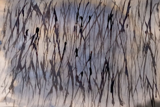
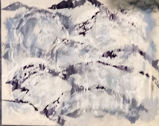
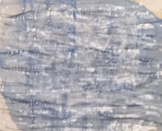
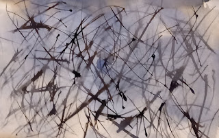
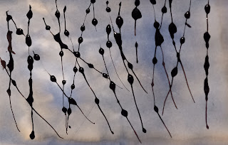
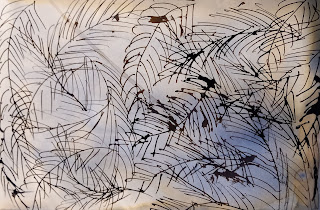
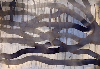
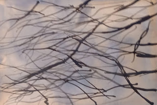
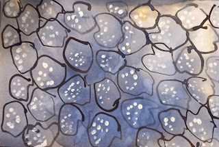
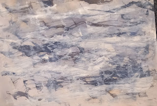
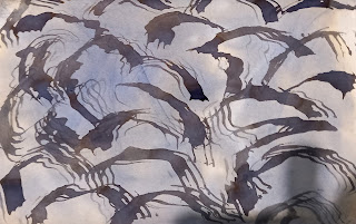
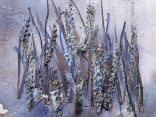
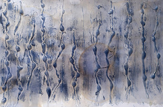
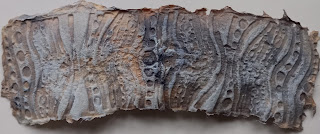
I tried some more flat texture papers, this time on cartridge paper. For each paper, I did two layers, first randomly splashing on very diluted Quink ink. Once this was dry I used a variety of tools to make marks inspired by my original research into texture in nature. I used a stick, a dip pen, a needle pointed squeezy bottle, a sponge brush and an old credit card cut into a zigzag shape. It was fun but very messy, definitely a latex gloves and old clothes activity! Here they are:
 |
5.11. flat 1
|
 |
| 5.11.flat 2 |
 |
| 5.11.flat 3 |
 |
| 5.11.flat 4 |
 |
| 5.11.flat 5 |
 |
| 5.11.flat 6 |
 |
| 5.11.flat 7 |
 |
| 5.11.flat 8 |
 |
| 5.11.flat 9 |
 |
| 5.11.flat 10 |
 |
| 5.11.flat 11 |
I then started trying to make some textured papers. I've put a caption on each one to say how I did it.
 |
5.11.tex 1
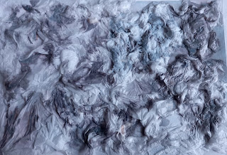
In this sample I covered an A4 sheet of cartridge paper with gel medium and then scrunched up some white tissue and let it slide around until I was pleased with how it looked. Once the glue dried, I splashed on at random some diluted Quink ink. |
 |
5.11.tex 2
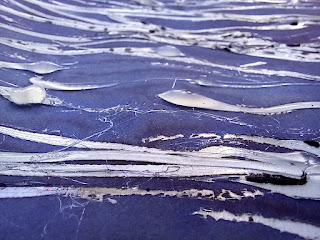
In this sample I used a hot melt glue gun to make streaks, then painted on some slightly diluted Quink ink. |
 |
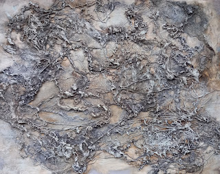
5.11.tex 3
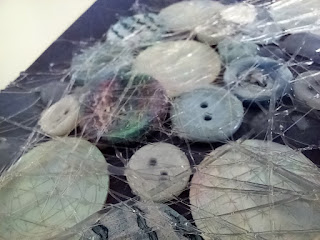
Here I first painted quite a concentrated solution of Quink ink onto cartridge paper then, once it was dry, used a hot glue gun to glue on a selection of buttons and mother of pearl discs. By a happy accident, when I lifted the glue gun, it lift a fine spider's web like thread behind. I liked this effect and was able to use it to cover the buttons with a web of fine threads of glue. |
 |
5.11.tex 4
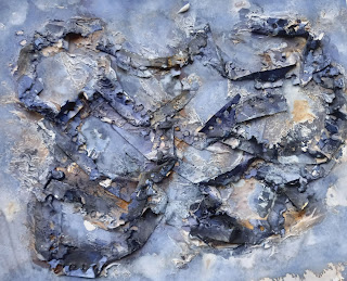
All the cartridge paper I'd used came from a spiral-bound sketch book. Sometimes I painted the paper before tearing it out and I was left with some painted trimmings with torn holes which gave an interesting texture. I glued it onto a pale background and, once dry, rubbed on some dark blue shoe polish to make the textures pieces stand out. I love the touches of amber-brown that are produced at random when the black ink is very dilute and splits into blue and brown in a very interesting way. |
 |
5.11.tex 5
Slivers of coloured paper, narrow strips cut from a textile experiment that didn't work and some blue and grey threads glued onto a tinted background. The textile was too dark for the composition and so I dabbed on some white acrylic paint afterwards. |
 |
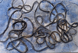
5.11.tex 6
A hot glue gun again with clear glue on a tinted background, this time, making deliberate blobs at random intervals. Dark blue shoe polish rubbed on afterwards to highlight the texture. I like how it marked the spaces between the lines of blobs too. |
 |
511.tex 8 (this was meant to be after tex 7 but Blogger is determined it should be before and I'm too tired to argue!)
This piece was pure serendipity. I'd bought some new socks for my husband but they proved to have a narrow band of a very tight elastic thread at the top and were digging in uncomfortably to his ankles. I had unpicked this narrow band and the unravelled elastic threads were sitting in a pile, looking beautifully textured and coloured blue, cream and brown. I glued them to a piece of cartridge paper, dabbed on some diluted ink and then, when dry, applied a little white gesso with an almost dry brush just to catch the top of the texture.
|
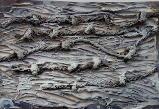 |
5.11.tex 7
Texture paste spread thickly like butter on cartridge paper and then, while still wet, the end of a paintbrush dragged through to make lines and grooves. Lengths of knotted string pressed into the paste. Once dry, painted with Quink ink. The result was too dark and so finally a thin layer of white gesso was applied.
|
 |
5.11.tex 9
Maggie Grey had a wonderful idea in her book "Long Diaries, Tall Tales" to make textured paper by tearing pieces of water-soluble paper into small pieces and putting them into a rubber stamp or texture plate, adding some water, and manipulating them so as to make a paper pulp. I had a texture plate and so tried it, using diluted ink instead of water so that I obtained coloured textured paper. I was really pleased with the design and would like to experiment some more with more organic plates. |
 |
5.11.tex 10
Very simple: string randomly glued onto cartridge paper, tissue paper glued on top and finally blue shoe polish rubbed on all over. |
I so enjoyed doing these textured papers. While I was working on them dishes were left unwashed and meals were late as I was busy having fun!
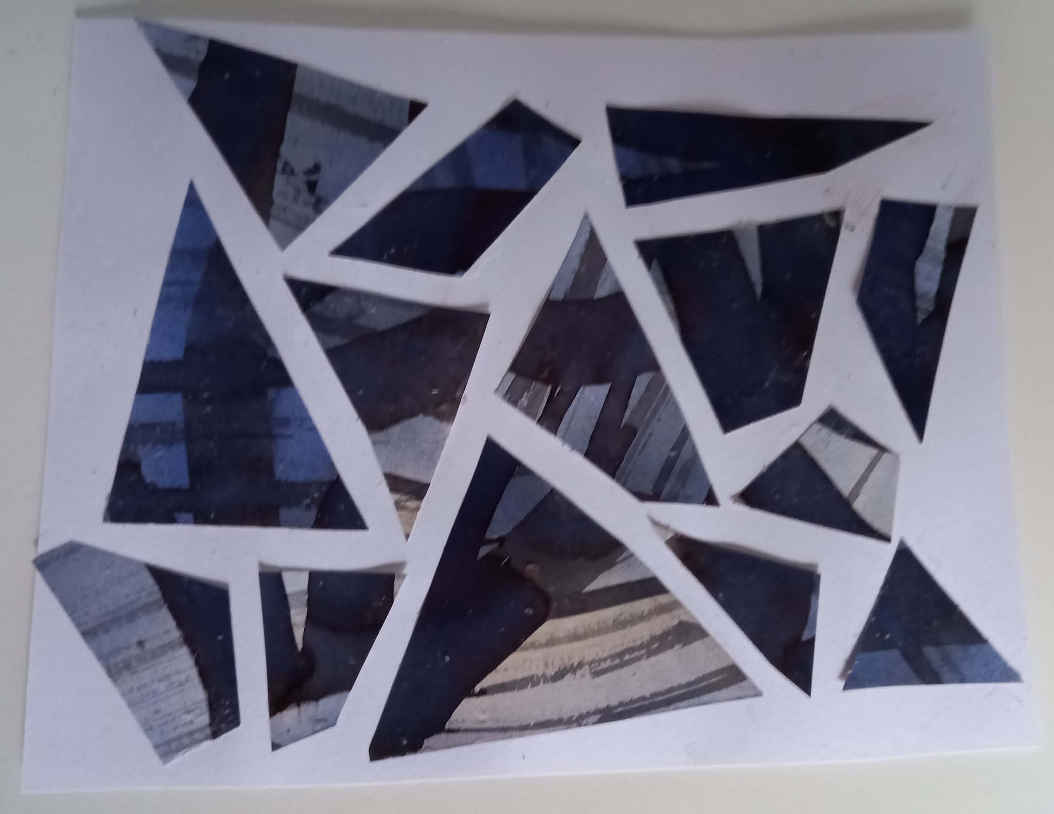
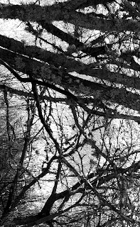
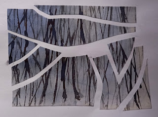
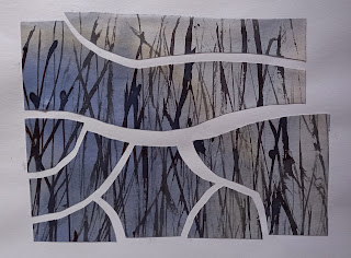
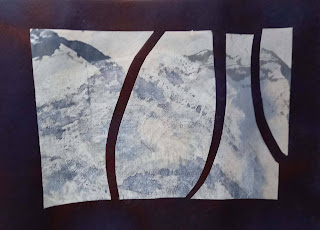
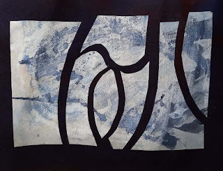
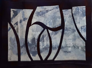
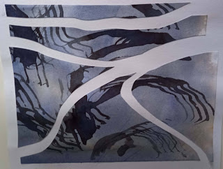
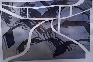
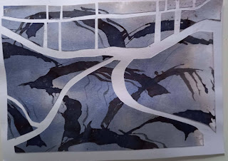
Finally, in this chapter, we were asked to refer to our original source images to look for simple divisions to create shapes. We were asked to start by making drawings, then choose one of our flat textured papers to cut up and apply to a contrasting background, leaving spaces in between the shapes.
Here are some of the drawings I did:
And here are some of the collages that I tried:
 |
| Design source 1 |
 |
| 5.11.design 1a |
 |
| 5.11.design 1b |
 |
5.11.design 1c
I cut three pieces in different ways |
 |
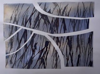
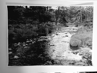
| design source 2 |
 |
| 5.11.design 2a |
 |
| 5.11.design 2b |
 |
| 5.11.design 2c |
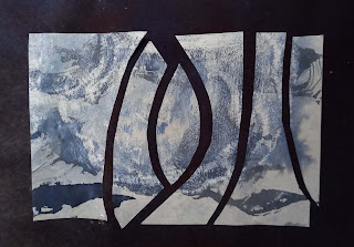 |
5.11.design 2d
Of the four designs for example 2, I like design 2b and 2c best, but I can't decide whether the balanced, more symmetrical design in c is better, or the asymmetric b. |
 |
| Design source 3 |
 |
| 5.11.design 3a |
 |
| 5.11.design 3b |
 |
| 5.11.design 3c |
I promised myself I would post on my blog before the end of August and so this is all I've had time to do. I haven't as yet found a design that I feel is really the one and so I intend to go on experimenting with designs until I find one that appeals. I have made the mistake in the past of rushing on to the final assessment piece of a module not properly prepared and so I am determined not to make that mistake again, but to take time to let the design process unfold naturally.
I almost forgot to add the section on abstract shapes. We could use shapes that were not present visually in our source images. This was fun. Here are the results of my experiments:
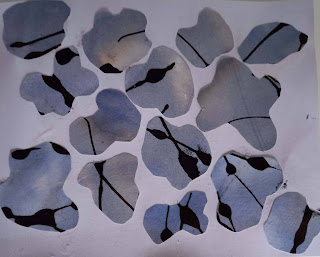 |
| 5.11.abstract 1: amorphous shapes |
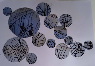 |
| 5.11.abstract 2: circles |
 |
| 5.11.abstract 3: negative shapes from various source images but randomly arranged |